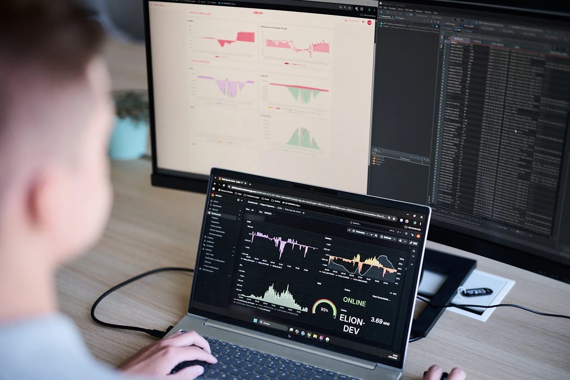
Dashboarding & reporting
Energy control only becomes truly useful when you can see and understand what’s happening. That matters for you and for your customers. They don’t just want to know whether their installations are doing what they should. They want proof that they’re delivering what you promised. With our intuitive dashboarding module, you can turn complex performance data into clear charts and statistics in no time. Reporting has never been this easy.
Insight, proof, and control at a glance
No room for interpretation
Every action is automatically translated into clear, understandable insights. You can see what’s happening, why a decision was made, and what impact it has on the installation. That means you can turn technical data into clear conclusions your customers can actually understand. No room for interpretation or need for more analysis. Whether your customers are highly technical or not, you can bring everyone along.
Flexibility as a selling point
Our dashboard shows when installations are being used flexibly and how that creates value for your customers. No vague sales claims: the proof is right there in the numbers. That gives you something concrete to bring to customer conversations and proposals. Flexibility stops being an abstract concept and becomes a tangible advantage of your services.
From raw data to polished charts
All the data from your installations is quickly transformed into clear, visual insights. No more manual calculations or chart-building. Our system does the heavy lifting for you. How much did your customer save? Where did you avoid a peak load? And how much value did it generate? With a single click, you can show your customers the numbers.
Trendspotting
The dashboard doesn’t just show you what’s happening today; it shows you how performance develops over days, weeks, and months. Compare installations across your portfolio and spot trends in consumption, flexibility, and returns. This gives you a clearer view of long-term performance and shows you exactly where there’s room to optimize.
Questions about dashboarding we hear a lot (and love to answer)
What exactly can I see in the dashboard?
The dashboard gives you real-time and historical insight into your assets:
- Live metering of every asset and connected site
- Historical metering and statistics on performance over time
- A bill simulation that contrasts the situation without control against the one with Stelmo control: the difference between “before” and “after,” in figures
You see in black and white what the control delivers, ready to use in your own client conversations and quotes.
How quickly are data and charts updated in the dashboard?
That depends on the type of data. Metering runs in real time: you follow your assets’ current performance moment by moment. The bill simulation updates as soon as all relevant market data is in, so the “before vs. after” comparison always rests on complete, reliable figures.
Can I tailor the dashboard to my business or customers?
Yes. We can visualize the data in various ways or expose it through an open API, so the dashboard fits your operations and those of your clients. What is shown, and how, we define together with you and the end client. That way the reporting fits your story, not the other way around.